
Starbasker Media
The Brief:
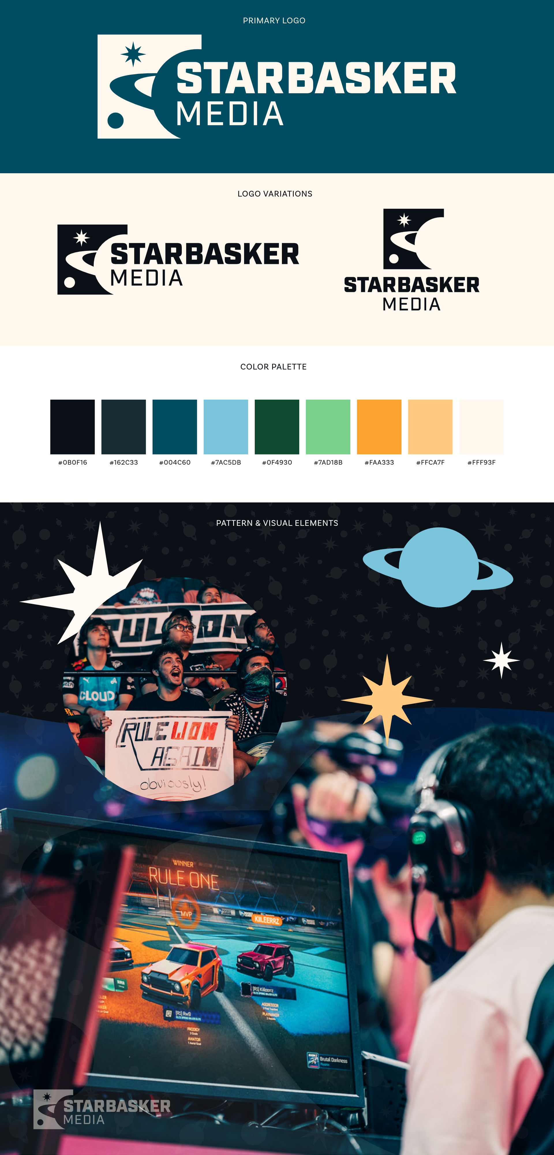
The client was looking for a new identity and updated branding for the side of her business that focused more on sports and eSports photography. The goal was to create a professional & sporty look that incorporated astronomical elements into the logo.
The Logo:
One of the things mentioned in our early discussions was that, while the client mainly shot digital images, she loved emulating film with the way she edits the colors in her images. Because of this, the idea of working with negative space came to mind. The logo replicates a snapshot you might see if you were to look at a film negative taken from an image of outer space.
Colors & Typography:
The color palette was directly influenced by the richness and warmth in the clients photography, which emulates her favorite type of film. Dark and light options for each color are incorporated to give the brand some versatility and range to work with.
Industry Inc was used for the logo to give the brand that sporty and professional feeling the client was looking for.