
Rule One eSports
The Brief:
A YouTuber named SunlessKhan reached out to me through a mutual associate that I had known in the industry with an idea to bring something new to the eSports scene for a game called Rocket League. Many typical eSports team logos are modern or futuristic, with bright and flashy colors. Sunless was looking to create something more grounded, something that felt more retro-inspired.
The Logo:
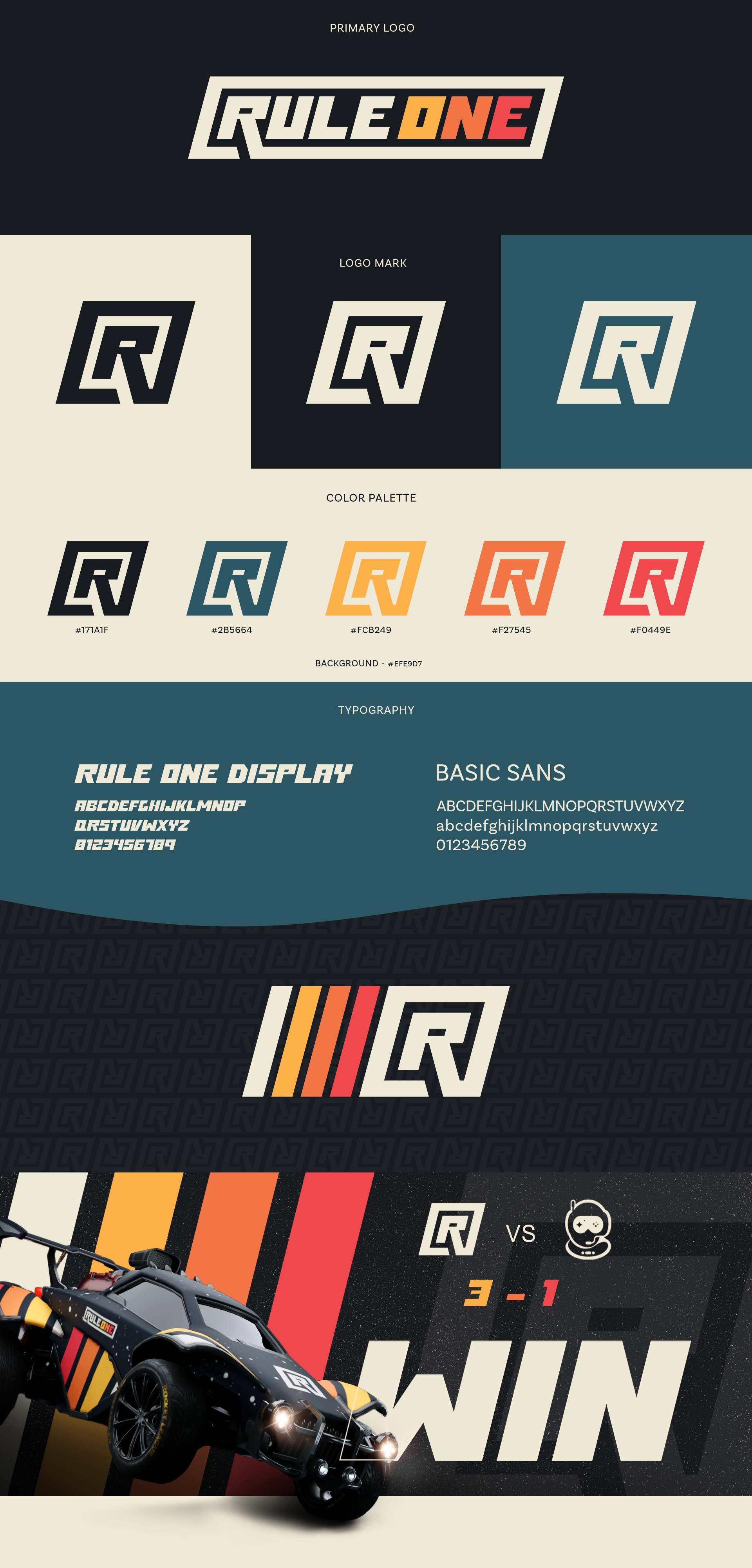
For the logo, we landed on an idea that could easily be adapted from a full logotype into a simplified logomark. This adds versatility and more applications across things like team jerseys, car designs (for in game), and social media graphics.
Colors & Typography:
To ground the colors into a warmer, more nostalgic feeling that Sunless was looking for, we used a cream and a softer black, rather than true white and black. The oranges and reds were very much inspired by the stripes on vintage VHS & cassette tapes, with the blue bringing a bit of balance to the rest of the warmer colors.
We also decided that Rule One needed its own display font to stand out amongst other eSports teams. Using the text from the main logo as the base, Rule One Display was created for main headline & display text for the brand.
Basic Sans was chosen as a secondary typeface for its softer and more inviting feeling, which contrasts the more aggressive and rigid text used by other brands in the eSports scene.